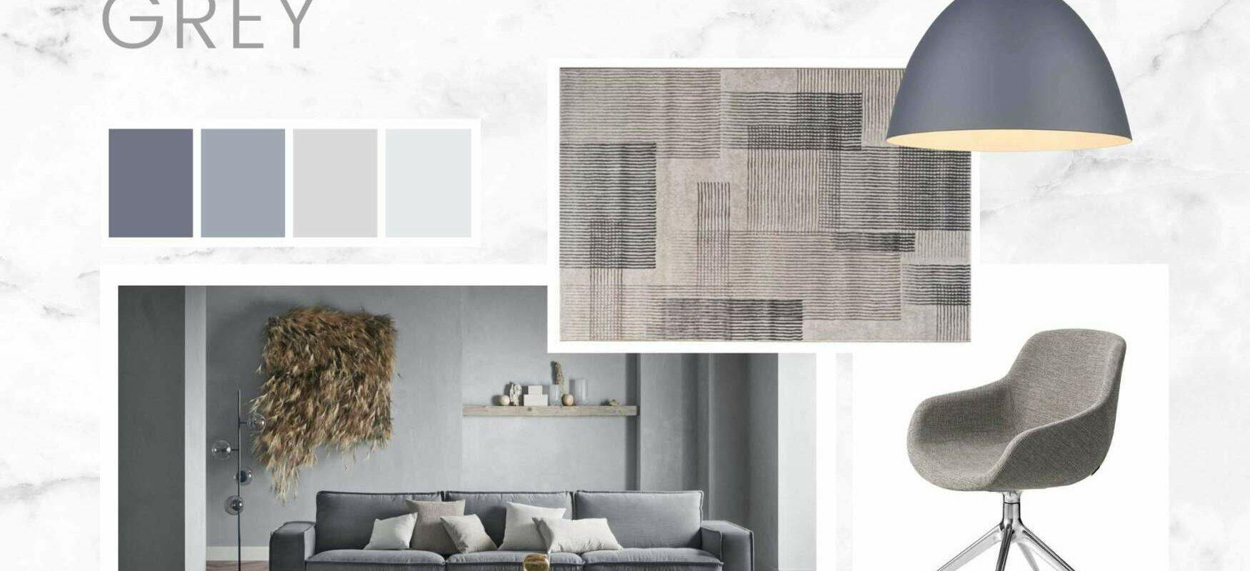
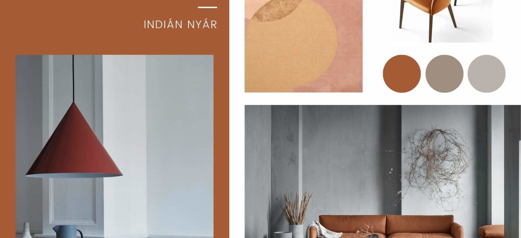
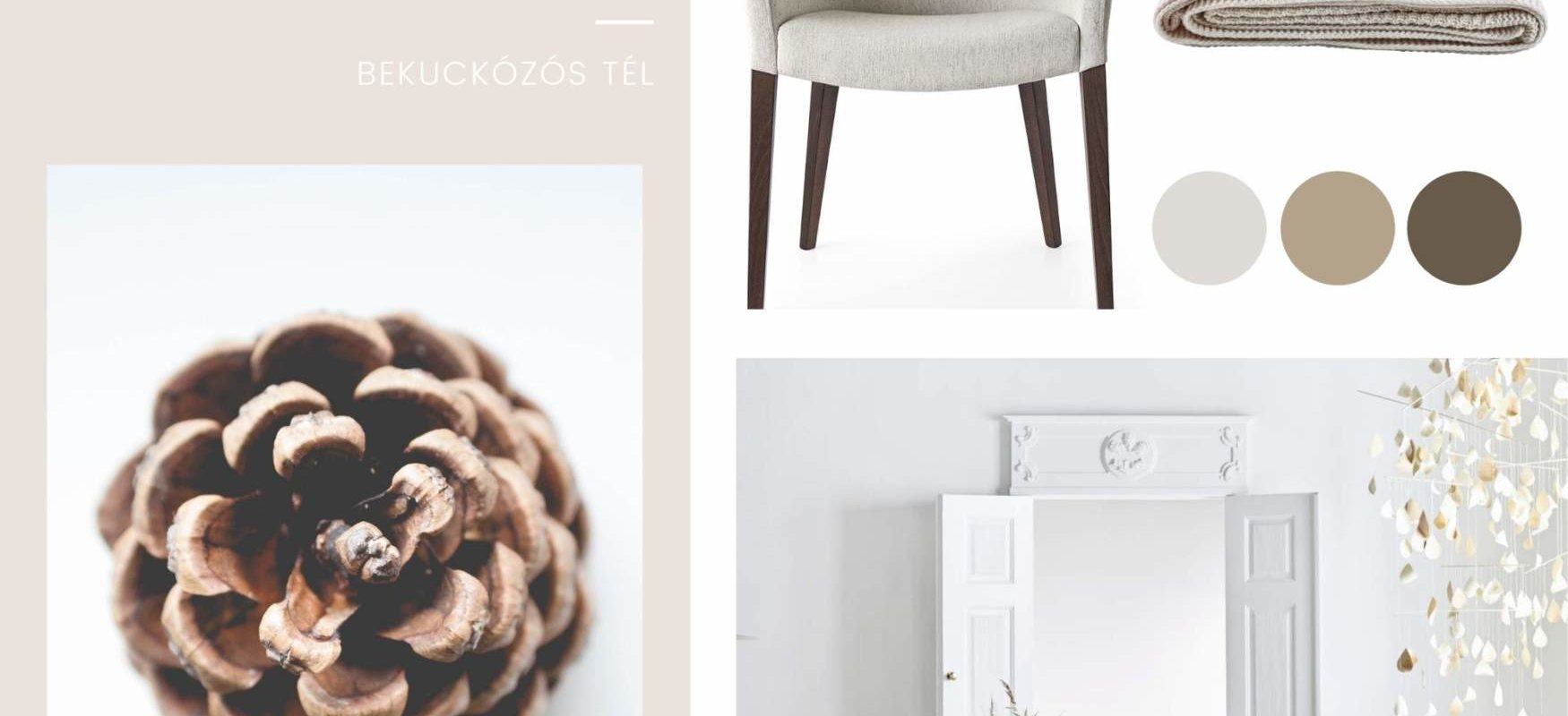
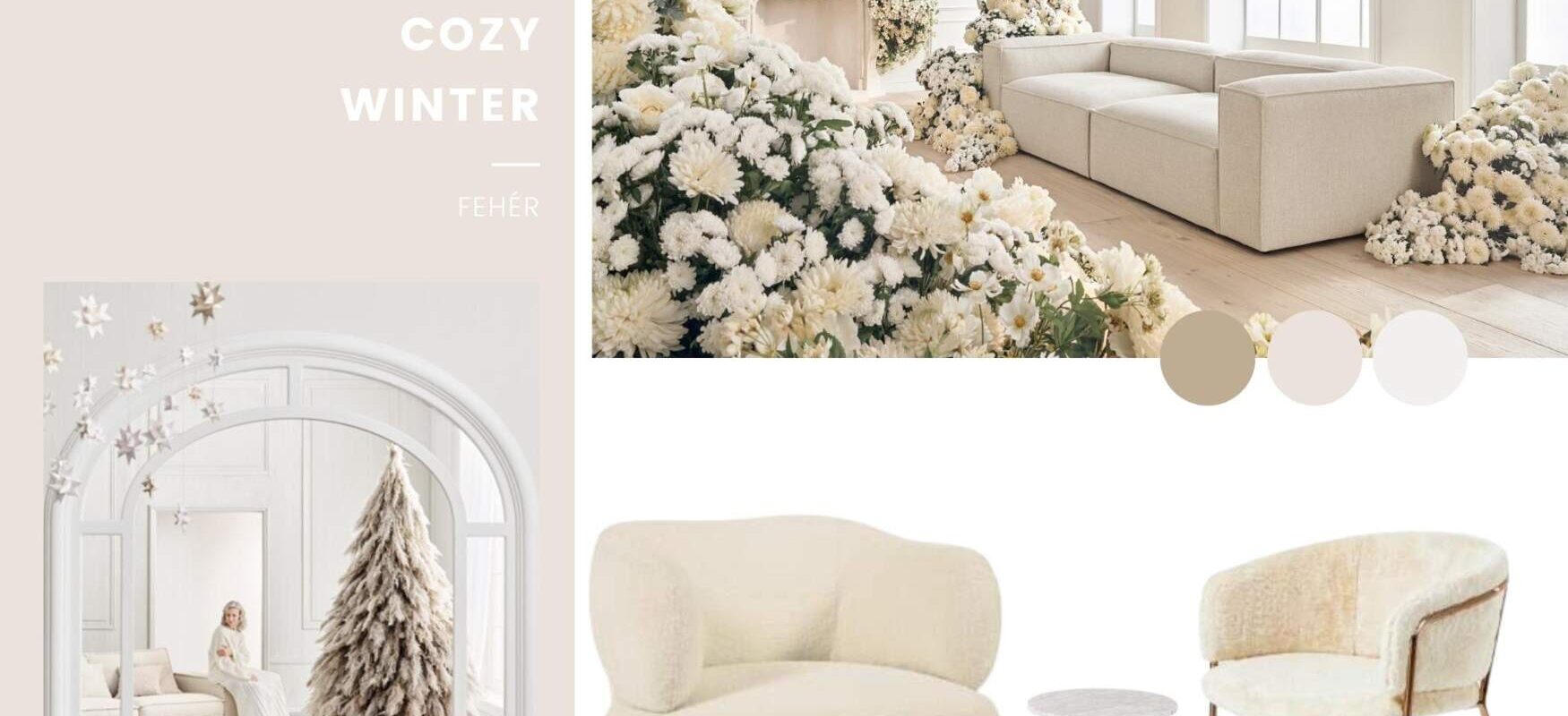
Opening Hours: Mon 12-16 | Tue-Fri 10-18 | Sat 10-14 ☕🐕 đŸšŽâ€â™‚ïž

Home / Posts Tagged "moodboard"

EARTHY NEUTRALS – August design tips

  When looking for inspiration, the colours of nature are always a good starting point. One of the biggest colour trends of recent times is the earthy, muted greys, browns, ochres and terracotta shades of the desert landscape, which are the essence of minimalism and…

FRESH SPRING – April design tips

  FRESH SPRING Our April design trend highlights the lush colours of spring, with a selection of furniture from our portfolio that is bursting with the fresh green of spring and its harmonising pastel shades. Unsurprisingly, green and its shades look great in any room,…

BOTANICAL GREEN – March design tips

Green is a harmonious colour that often represents nature and is associated with health, youth, safety and environmental awareness. So we can think 'green' not only in terms of sustainability, but also literally! Green is the least straining on the eyes, so it's very relaxing…

VERY PURPLE – February design tips

Pantone's colour of the year 2022, PANTONE 17-3938 Very Peri, is a dynamic shade of blue with a vibrant violet-red undertone that combines the fidelity and permanence of blue with the energy and excitement of red. So for designers and product developers in the apparel,…

LIGHT AND DARK – January design tips

For some time now, bright, natural, beige shades of Scandinavian style have been gaining ground in interior design. Many people are afraid of darker-colored home furnishings. But if used correctly, dark shades and contrasting accessories can give the space a special intimate yet luxurious atmosphere…